A long list of rows in Excel is hard to read: totals are unclear, trends are hidden, and every small question becomes a new formula. With an Excel pivot table, you can turn that same list into a clean summary in minutes—such as sales by month, expenses by category, or tickets by status—without changing your original data. This guide walks you through preparation, the exact clicks to build a PivotTable, and what to do when grouping or refresh does not work.
Introduction
If you have ever tried to answer a simple question from a spreadsheet—“How much did we spend per category?”, “Which product sold most?”, “How many items were returned each month?”—you know the usual pain. You scroll, filter, add quick totals, and still feel unsure because every view only shows part of the picture.
A PivotTable is designed for exactly this everyday situation. It is an interactive summary you can rearrange on the fly: move a field from rows to columns, switch the calculation from Sum to Count, or filter to one region—without rewriting formulas or touching the raw list.
Below, you will set up a clean data source, build your first PivotTable, and learn the two habits that keep PivotTables trustworthy: grouping dates correctly and refreshing results after data changes.
Basics and Overview
This tutorial applies to current desktop versions of Microsoft Excel (Windows and macOS). The ribbon names can vary slightly, but the logic is the same: you pick a data range, insert a PivotTable, then place fields into four areas.
Key terms you will see in Excel:
- Source data: your original list (for example, a table with Date, Category, Amount, Region).
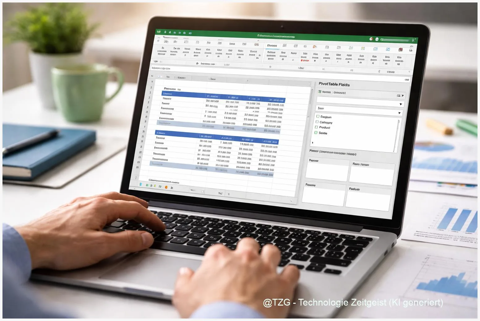
- PivotTable Fields: the panel where you choose what to analyze. Typical areas are Rows, Columns, Values, and Filters.
- Values: the calculation area (Sum, Count, Average). Numbers usually go here.
- Refresh: updating the PivotTable so it reflects changes in the source data.
A PivotTable does not replace your data list—it gives you flexible “views” of the same data, so you can answer questions quickly and consistently.
In practice, PivotTables are perfect for summaries that would otherwise require many formulas: totals by month, counts by status, top-10 lists, or comparisons between regions. If you later need a visual, you can add a PivotChart (a chart linked to the PivotTable) after the summary is correct.
| Option or Variant | Description | Suitable for |
|---|---|---|
| PivotTable (new worksheet) | Excel creates the PivotTable on a separate sheet, away from the raw data. | Most people; clean layout and fewer accidental edits. |
| PivotTable (existing worksheet) | You place the PivotTable next to your data or in a dashboard area. | Reports and dashboards where layout matters. |
Preparation and Prerequisites
Most PivotTable problems are not “PivotTable problems”—they come from messy source data. Spend two minutes on preparation and you save a lot of debugging later.
Check these prerequisites before you insert the PivotTable:
- One header row: each column has a clear name (no merged cells in the header).
- No completely blank rows or columns inside the list. A blank row can split your data range.
- Consistent data types: dates are real dates (not text), amounts are numbers (not “$12” stored as text).
- Prefer an Excel Table: click into your data and press Ctrl+T (Windows) or Cmd+T (Mac). Tables expand automatically when you add new rows, which makes refreshing more reliable.
If your list comes from an export (shop system, banking CSV, helpdesk tool), do a quick scan for common troublemakers: empty date cells, “N/A” mixed into numeric columns, or different spellings for the same category (for example, “UK” vs “United Kingdom”). Fixing these improves the quality of every summary you build.
Step-by-Step Instruction
The steps below follow Excel’s standard flow: select your data, insert the PivotTable, then build the summary by placing fields. The exact tab name can be Insert and the PivotTable tools tab can appear as PivotTable Analyze when you click inside the PivotTable.
- Click a cell inside your data list (or select the full range). If you converted the list to an Excel Table, clicking one cell is enough.
- Go to Insert > PivotTable. Excel opens a dialog asking for the table/range and where to place the PivotTable.
- Choose the placement: select New Worksheet for the cleanest start, then confirm with OK.
- Build your first summary in the PivotTable Fields pane:
- Drag a text field (for example, Category or Product) to Rows.
- Drag a number field (for example, Amount or Units) to Values.
- If Excel counts instead of sums, open the value field settings (usually via the small dropdown next to the field in Values) and switch to Sum.
- Add a time view (optional but common): drag a Date field into Rows (or Columns). If it shows individual dates, you can group it: right-click a date in the PivotTable > Group > select Months and Years (or Quarters) > OK.
- Add a filter for quick focus: drag a field such as Region, Channel, or Status into Filters. Use the filter dropdown above the PivotTable to show only what you need.
- Check the result for plausibility: compare one or two totals to a known number (for example, the sum of the Amount column). This simple check builds trust in your report.
- When your source data changes, refresh: click inside the PivotTable and choose Refresh (often on PivotTable Analyze) or right-click the PivotTable and select Refresh.
If everything worked, you should now see a compact table with totals, plus expandable groups if you grouped dates. The best part: you can rearrange the same PivotTable anytime by dragging fields to different areas—no new formulas required.
Tips, Troubleshooting, and Variants
PivotTables are forgiving, but a few issues appear again and again. These fixes are usually enough for everyday work.
Problem: New rows are not included after refresh.
If your source was a fixed range (like A1:D500), Excel will not automatically extend it. Convert the source to an Excel Table (Ctrl+T / Cmd+T) and rebuild the PivotTable, or use Change Data Source to point to the expanded range.
Problem: “Cannot group that selection” when grouping dates.
This often happens when the date column contains blanks, text values that look like dates, or mixed types. Fix the source: remove blanks (or fill them), convert text to real dates, then refresh. Grouping can also behave differently depending on how the PivotTable was created (for example, with certain data model scenarios). When in doubt, try creating a fresh PivotTable from the cleaned table.
Problem: Values show as Count instead of Sum.
Excel switches to Count when it detects non-numeric entries in a column. Check the source column for stray text like “-” or “N/A”. Clean it, then adjust the Value Field Settings to Sum and refresh.
Tip: Keep reports stable when refreshing.
PivotTable options let you control behavior like keeping formatting or column widths after refresh. This is useful when you share a workbook or use the PivotTable in a dashboard layout.
Variant: Filter dates with a Timeline instead of grouping.
If you want an easy, slider-like date filter, use a PivotTable Timeline. It lets you filter by year, quarter, month, or day without permanently changing the row labels.
Variant: Add a PivotChart after the summary is correct.
A PivotChart is great for showing trends and comparisons, but it only makes sense once your fields and grouping are right. Build the PivotTable first, then create the chart.
If you want to go one step further, keep your raw data and analysis separate: one sheet for the table, one for PivotTables, and one for charts. This reduces accidental edits and makes refresh behavior easier to understand.
Conclusion
A PivotTable is one of the fastest ways to summarize data in Excel without turning your workbook into a fragile maze of formulas. When your source list is clean (clear headers, consistent types, ideally formatted as an Excel Table), creating a useful summary is mostly drag-and-drop: put categories in Rows, numbers in Values, and add filters as needed. The two reliability steps are simple: group dates only when they are real dates, and refresh whenever the source changes. With that routine, your PivotTable stays accurate and easy to adapt.
Try building one PivotTable from a real list you use (expenses, sales, study tracker) and share what worked—or what got in the way—so others can learn from your setup.


Leave a Reply